
clean, simple design for easy recognition was the goal of developing this brand
project
the witches brew kombucha
Year
2014-2018
skills
#1 kombucha in toronto by goop
brewmistress
commercial interior design
brand development
packaging + design
wholesale distribution
awards | press
#1 kombucha blogTO
#1 kombucha goop
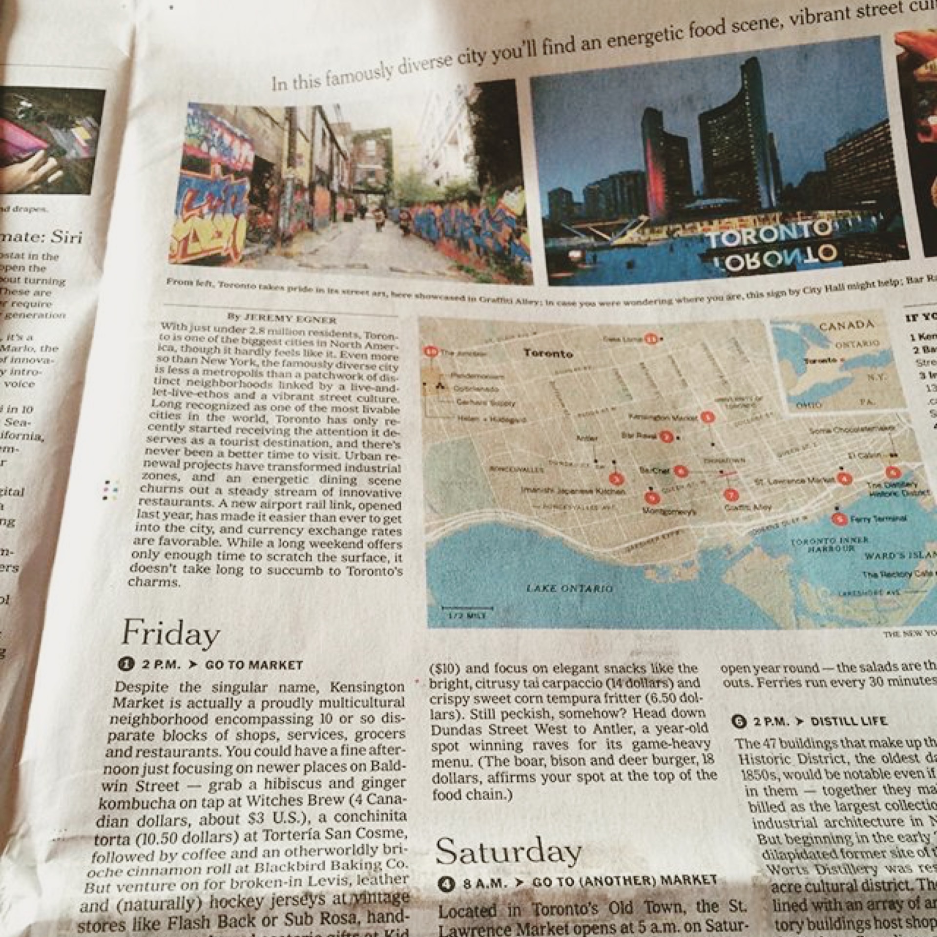
36 hrs NYT
best kombucha Toronto Life
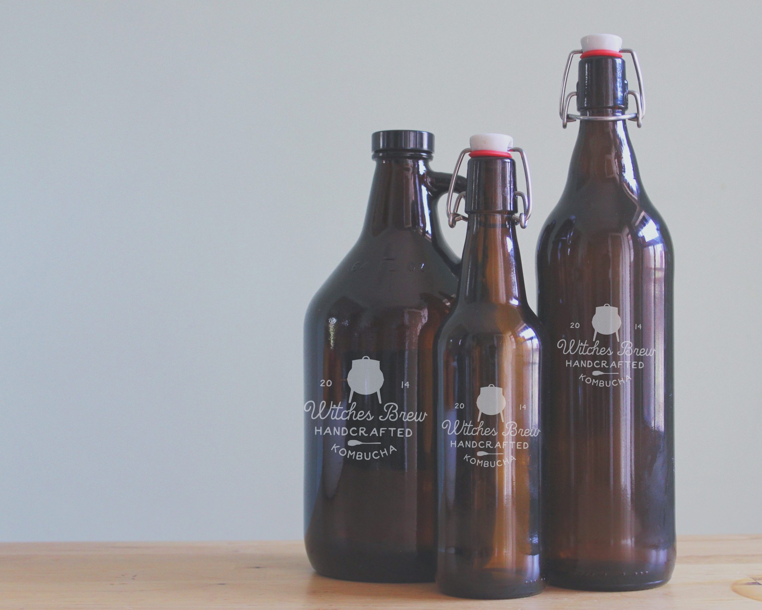
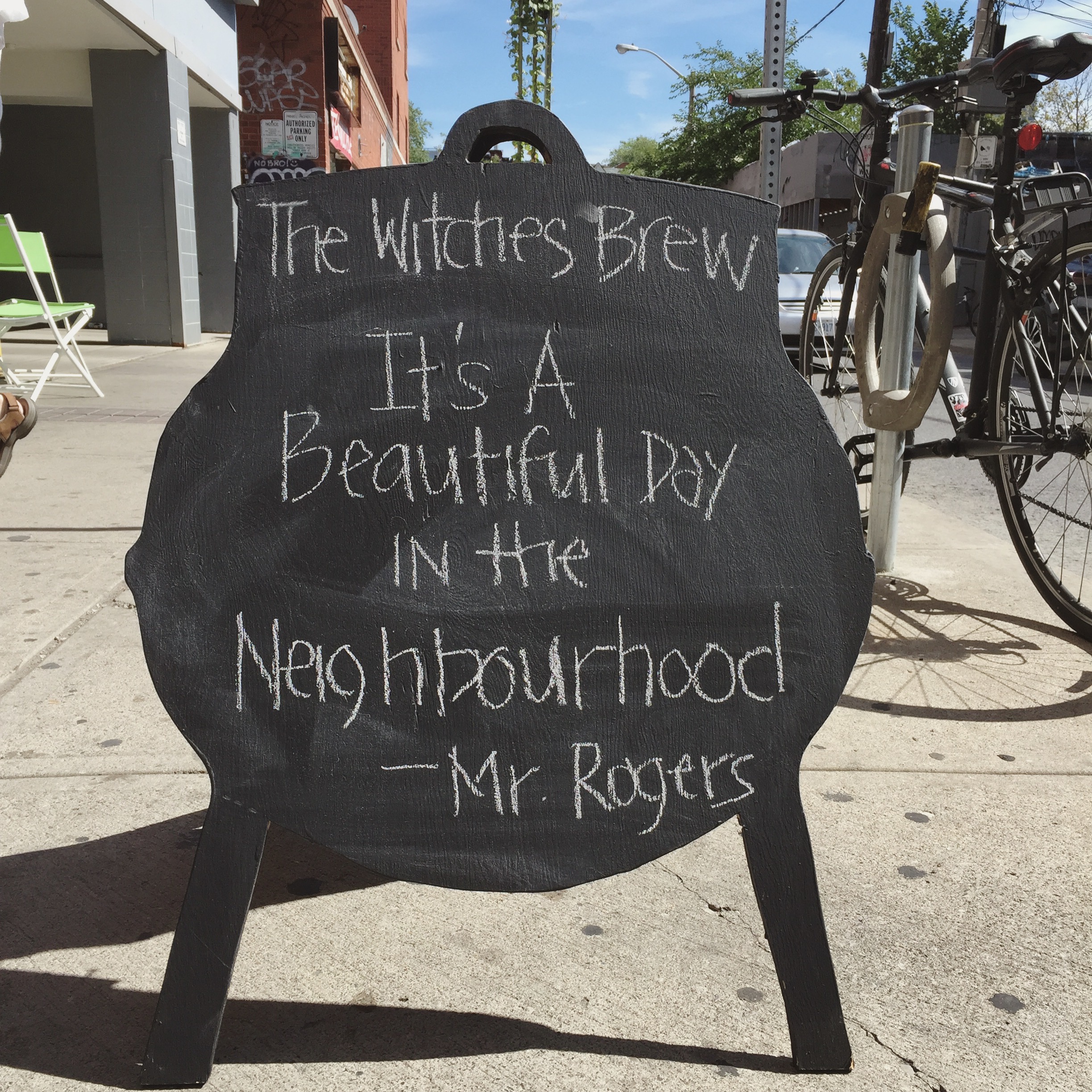
I stuck to the basic principle of keeping it simple
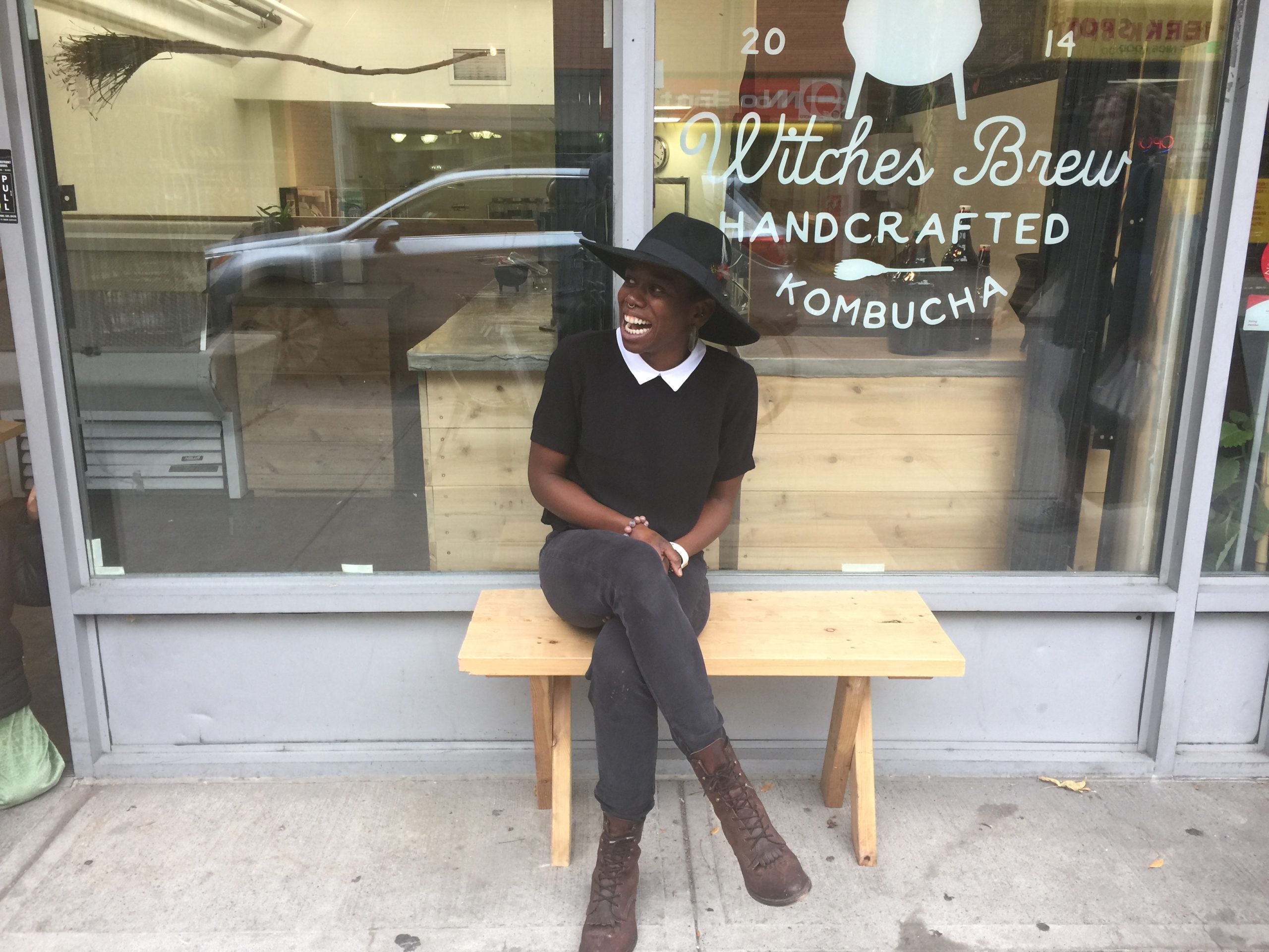
the witches brew was built on a dream that was simple – to make good kombucha on tap a staple grocery item. being located at the mouth of the most historical multi-cultural markets in Toronto, Kensington Market, essentially the heart of the city, made this a dream that came faster than anyone could have imagined.
it’s been 8 years, and there hasn’t been a week that passes, no matter where on this earth I am, where a complete stranger tells me of their experience of the witches brew. the outpouring of love for something I made, still overwhelms me after all this time.
in addition to simple design and sustainable practices such as using reusable closed bottle system and brewing in small batches, centering the black experience, my experience, was at the core of this brands development. i believe that that is what left it’s mark on the community that grew from a scoby I bought off a woman from craigslist for $5 on the corner of Spadina and Bloor. centering blackness, centres the most marginalized. when you do that, you make your space accessible to just about anyone. everyone feels welcomed because all barriers are removed. that was the key to the success of this project, one that I am immensely proud of.